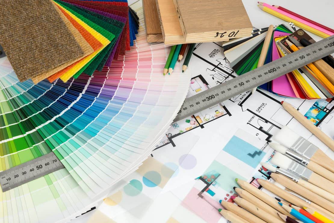
Choosing a colour scheme: Should all your picture frames be the same colour?
Picture frames are beneficial additions to your home as they provide support and protection while enhancing the visual appeal of your photographs. It’s vital to select the right colours for the frames as this can highlight key elements of your interior décor and make the images appear larger. You can use a variety of colours for different walls, pictures, rooms, spaces, etc., but there are several factors to consider when selecting colours to use.
The basic colours
There’s a reason white and black frames have stood the test of time – they offer a stylish option for hard to design spaces. White frames create a consistent theme by keeping a uniform look, thus allowing the photographs to take the centre stage. White frames allow the light hues in pictures to blend into the background, and the darkness to stand out. These frames are suitable for candid and casual pictures. A lot of white frames look fairly similar, so the process of choosing a suitable one can be tricky. Consider the profile, shade and texture for the best overall outcome.
A black frame, on the other hand, acts as a contrast to the lighter features in your pictures. They complement a wide range of photographs because they’re versatile and elegant. These frames help to create a well-balanced focal point of the space. There are numerous designs for coloured picture frames, ranging from ornate frames to clean aluminium.
The colour of the picture
If the picture is in black and white, use traditional colours for the frame to ensure continuity by complementing the colour scheme. For a sophisticated monochrome look, you can use a variety of colours for the frame, including grey, silver, white or black. But you can still incorporate a modern twist with colours such as blue or green.
It’s vital to follow the essential principles for colour photographs as well. You’ll have two main options to choose from. The first one is to use one of the colours in the picture as the basis of the frame, and the second is to use elements in the picture you want to enhance.
The advent of the internet has enabled experts to use programs such as Photoshop to edit pictures and insert any type of background. Consider professional editing services if you want to enhance the pictures. This way, you can easily match the colours in the picture with other aspects of the room, including the wall colour.
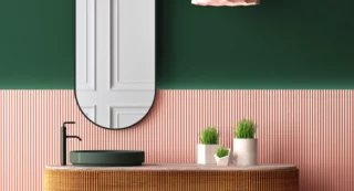
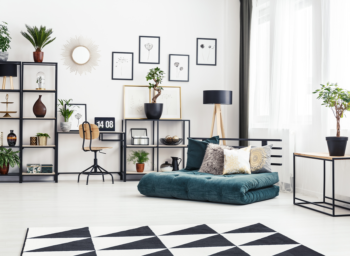
The interior décor of the room
Make sure the picture frames blend well with other existing colours of the interior décor. Consider the colour values, the theme, artwork and ambience. You can maintain a balance by using warm and cool colours for the frames as they apply to a variety of situations. Warm colours occur in nature during autumn and they include yellow, orange, red and brown. Cool colours occur during spring and they include violet, green and blue.
Pictures that complement the art in the room enable a person to focus on the subject matter of all images on the wall. For example, if the artwork is focused on a resort located next to a beach, choose warm colours for the frames. If the beach is the main subject, cool colours will be suitable.
If the theme of your house is chic and elegant, shabby chic frames will blend perfectly with the rest of the décor. But you can try vintage photo frames if your style is more traditional than contemporary.
The type of picture
There are two main types of pictures: traditional and modern. Softer colour tones are suitable for traditional pictures, but bright and daring colours can be used for modern frames. Traditional pictures are often reminiscent of a particular period in history. A natural-looking frame with plenty of grains will work well when tied with predominantly cool colours. If you’re unsure of the type of frame to use, check if there are trees or any other forms of wood in the picture. Use a wood frame that closely mimics this style for an authentic appeal.
For modern pictures, you can work with picture frames that exemplify the movement in architecture or style. A frame design that has straight lines with bright, bold colours will be appropriate.
The environment the pictures are displayed
Ask yourself: will the picture be displayed in a public place or is it personal? If it’s the latter case, then there are only a few limitations with regards to the colours to use. But if the picture will be sold or mounted in a public place, the design and colour of the frame must appeal to a mass audience. For such a situation, choose black and white to enhance visual appeal.
The external surrounding also matters, so consider the design of the building and other landmarks nearby. But always choose colour combinations according to your personal preferences.
The number of pictures in the frame
Frames effectively display multiple pictures. After identifying a colour scheme, you can easily select the best colour for the frames. For example, you can use white frames to bring together photos taken during a wedding ceremony. Getting the colour right is crucial because a wrong selection can isolate a specific picture, which consequently draws more attention to it and defeats the purpose of having multiple photographs.
You can also create a collage of frames and photos to showcase a variety of memories. Before you do this, choose an easily accessible spot with sufficient light. You can then choose different colours for the frames. For example, if the photographs are of your children growing up, their room will be a suitable location. But if it’s a family portrait, then the sitting room will be the best place for the gallery.
A final note
These considerations depend on each other so you may be required to compromise on colour choice at times. For example, although a certain colour may complement your pictures, it may be unsuitable for the interior décor or the external environment. The colours of the picture frames need to enhance the visual appeal of the images. This is often achieved by either complementing the surroundings or enhancing the picture.